Whistle Pig Brewing, originally conceptualized as Colorado Compass, sought to establish a compelling and cohesive brand identity that reflected their love for hiking, biking, and the Colorado landscape. As part of their launch strategy, they required a complete visual identity, including logo design, business cards, signage, coasters, beer can labels, various event materials, and print advertisements.
Challenges
The brewery’s original name, Colorado Compass, faced potential legal conflicts due to existing trademarks in the brewing industry.
A new name and visual identity needed to be established within a tight timeframe before a critical business presentation at Sam Adams’ “Brewing the American Dream” event in Denver.
The brand needed to reflect the founders’ passion for the outdoors and create a recognizable identity within the competitive craft beer market.
Solution
Working closely with the founders, I helped bring their vision to life through a comprehensive branding approach:
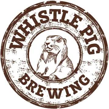
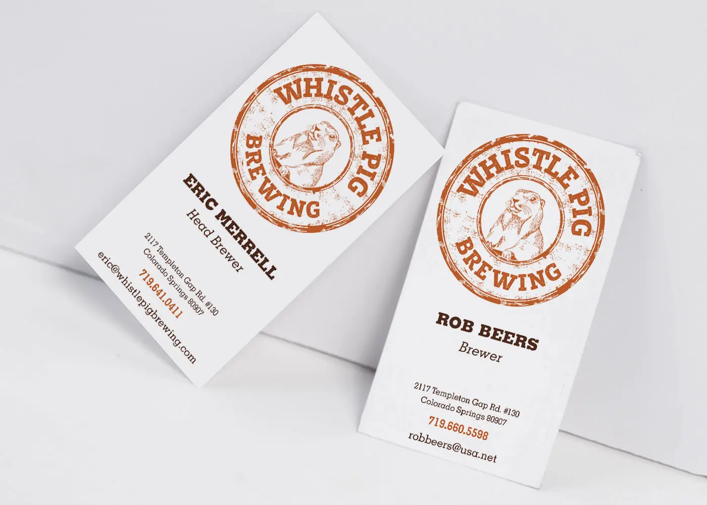
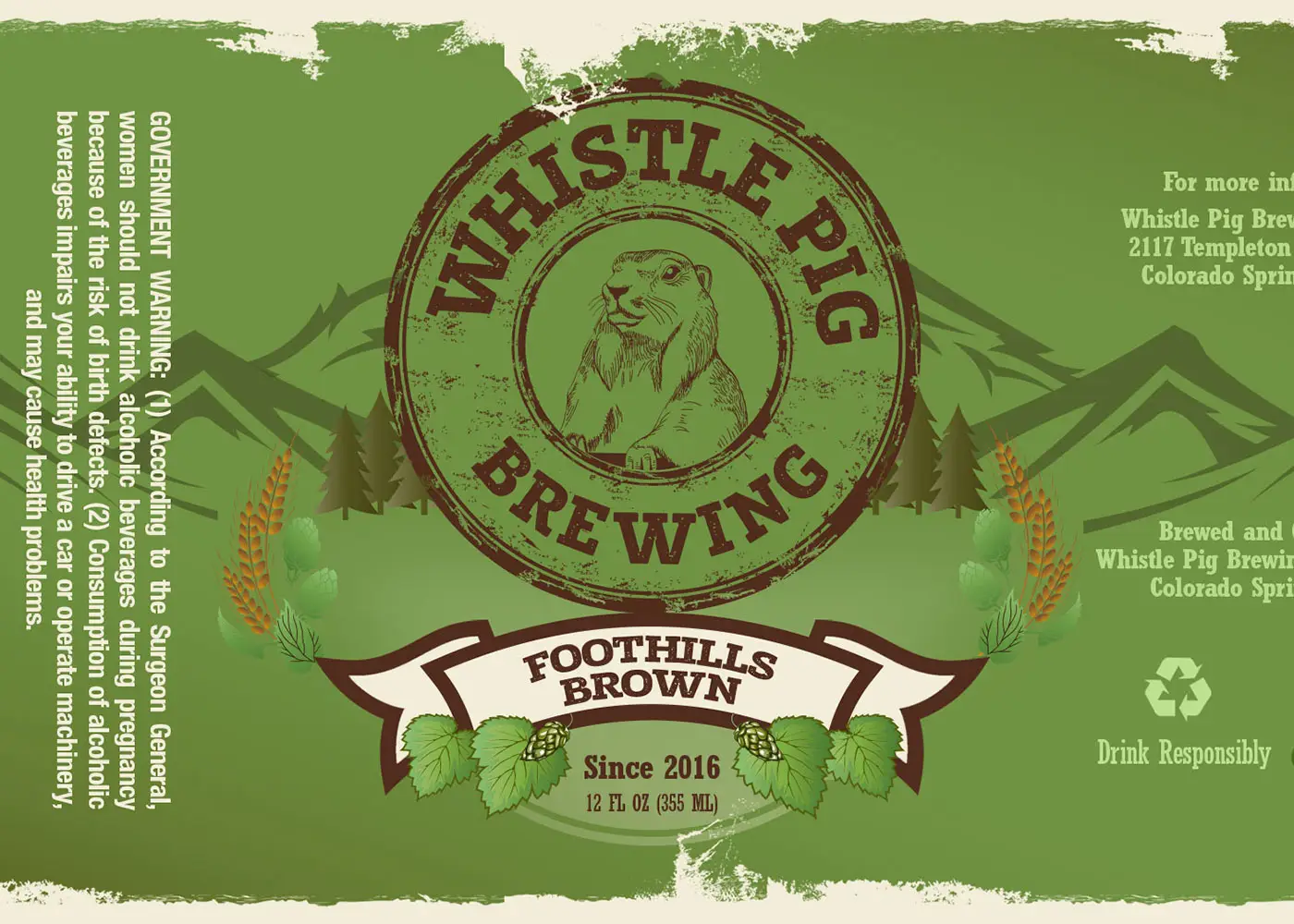
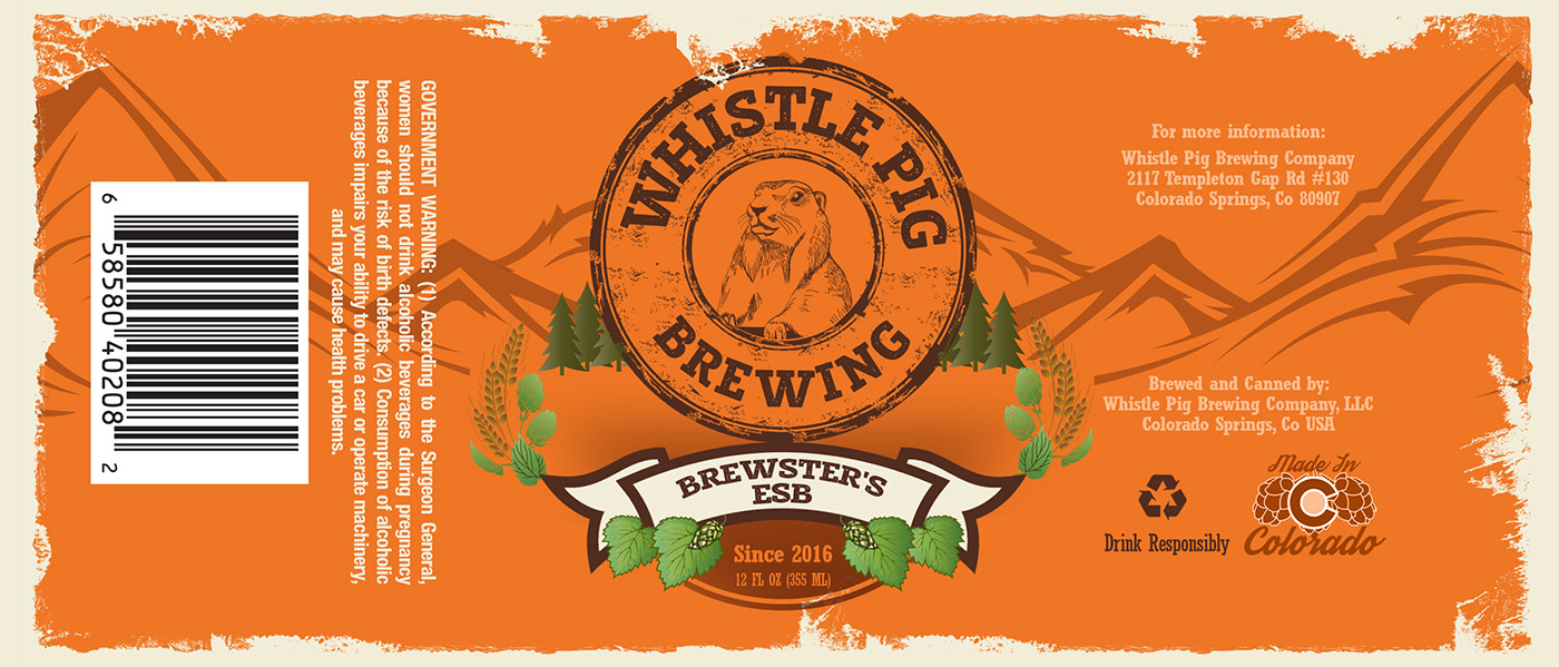
Logo Design: I created the final logo inspired by the National Park signage. It features a bold yet simple illustration of a marmot (often called a “whistle pig”) within a circular emblem reminiscent of the iconic New Belgium Brewing logo.
Brand Identity & Visual Direction: The branding embraced a rustic, adventure-inspired aesthetic with typography and colors that reflected national park themes, aligning with the brewery’s storytelling and outdoor roots.
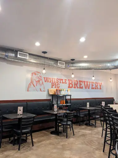
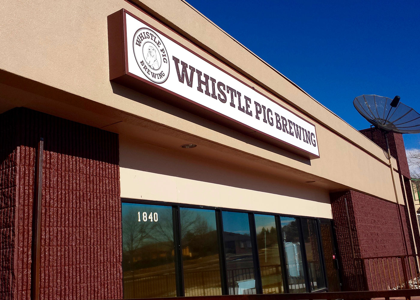
Collateral Materials: Designed business cards, coasters, and signage seamlessly integrated with the brewery’s theme.
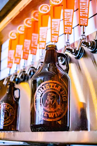
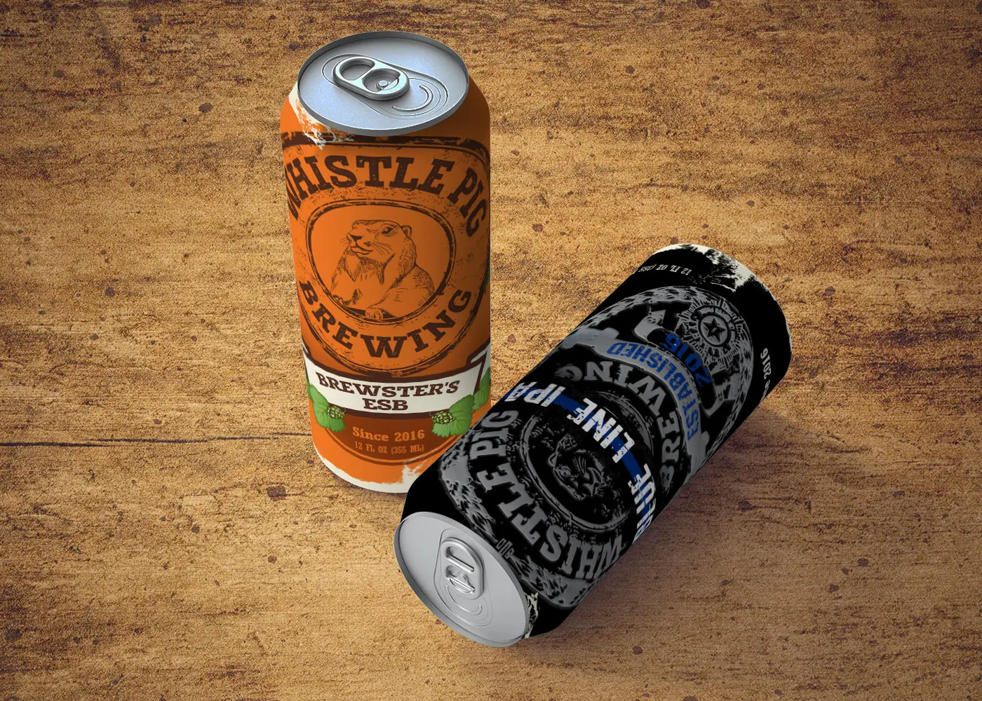
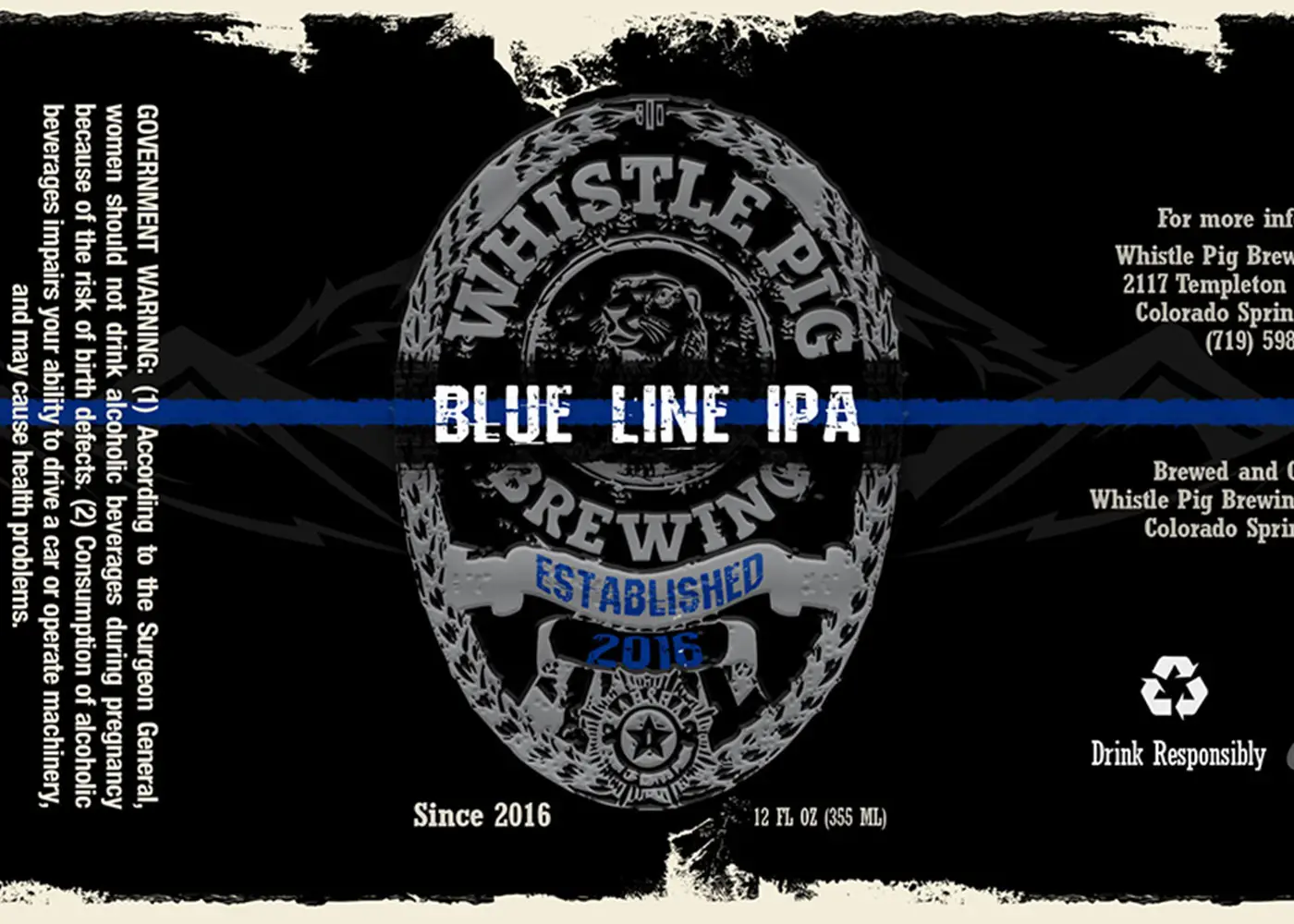
Beer Can Labels: Created unique and recognizable beer can designs, each inspired by Colorado’s trails, landmarks, and history.
Marketing & Event Materials: Developed print advertisements and event collateral to support the brewery’s promotional efforts.
Results
A Strong Brand Foundation: The new name and logo instantly resonated with the founders and their community, creating a meaningful identity that reflected their journey and values.
Enhanced Recognition & Engagement: The branding helped solidify Whistle Pig Brewing’s place in the local craft beer market, fostering a loyal following.
Community Connection: The branding process became a story of collaboration and friendship, strengthening the brewery’s mission of bringing people together.
Conclusion
The Whistle Pig Brewing branding project is a testament to the power of storytelling and thoughtful design. By drawing from the founders’ personal history and love for the outdoors, I was able to craft a visual identity that continues to shape their brand’s growth and customer engagement. The Whistle Pig logo and branding elements have since become integral to their business, embodying the spirit of camaraderie and adventure that defines the brewery.
from the POV of the client
"Now this whole time Ray, a graphic designer, had been quiet. After the friends all agreed on Whistle Pig, Ray sent a text. A Simple image of a majestic marmot with the words “Whistle Pig Brewery,” in a font similar to what you would see on a national park sign. He also said in the text, “Took you long enough to agree.” Later he, eric, and Rob agreed it needed a circle something simple like the iconic New Belgium Bike in a circle logo. "