

AdPro Logo
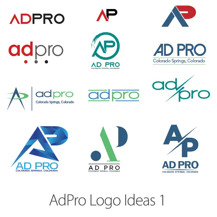
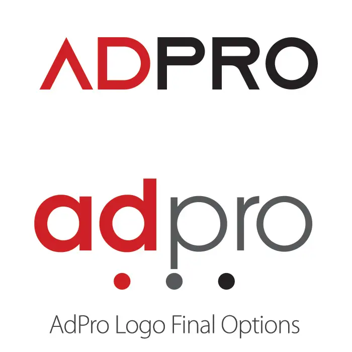
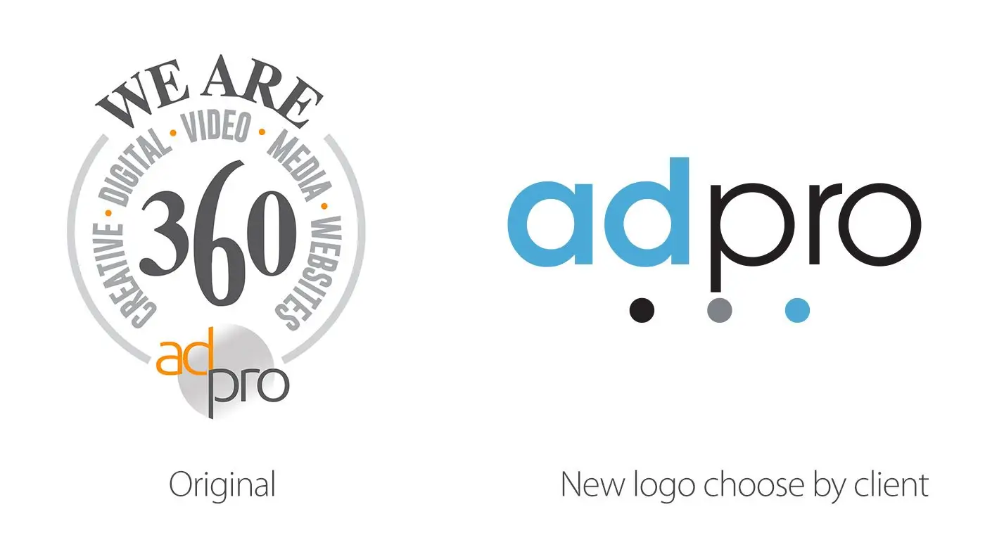
AdPro 360, a Colorado Springs advertising agency, approached me to revamp its logo and establish a new corporate identity to commemorate its tenth year in operation. They needed a logo highlighting their experience and current approach as a full-service marketing business with state-of-the-art audio and video production studios. I submitted 22 distinct logo concepts, which we whittled down to two finalists. Finally, we chose a logo that reflected their new brand colors of black, grey, and light blue. The new logo embodies their goals and gives them a contemporary and competitive edge in the marketing business. The result is physically attractive and conveys their brand identity with a strong, streamlined appearance. AdPro 360 may confidently refresh its identity and attract new clients while preserving old ones with the new logo. The new logo symbolizes their dedication to growth and innovation while maintaining their reputation as a reliable marketing partner.